The stories behind the citations
Once again, the editors of DESIGN have asked the designers of the citation-winning projects to tell their stories. It is our way of giving readers more than the attractive photographs and succinct descriptions found in the “Architectural Submissions”—to present readers with the “value-added” of real-world perspectives on the creation of long-term care facilities having outstanding design merit. Also included is a sidebar on the projects the DESIGN 2008 jurors thought deserved Honorable Mention, and the distinctive features that gained them special attention. What follows are design project stories told by the architects in their own words, in interviews with DESIGN Editor-in-Chief Richard L. Peck.
The Villages of North Branch, North Branch, Minnesota
Gregory A. Woollums, KKE Architects; Jauson L. Almer, Encompass Interiors; Steven Mork, Ecumen
Page 82
Woollums: The existing county-owned nursing home was aging and losing money. Both county and city leaders needed to be educated in the nursing home business in order to make the right decisions for the community.
Mork: In the early stages of negotiations, Ecumen hoped the county would build the community and lease it back with an option to buy. However, a majority of the commissioners decided that they wanted out of the nursing home business. At one point, the new county commissioners wanted us to go directly to the public, so we held community information meetings around the county. The commissioners started to see community support and began to understand the plan. However, they still wanted out, so Ecumen suggested they put out a Request for Proposals. The Ecumen proposal replaced the lease concept with a buy-out approach. However, there was significant opposition to the need to sell county land at the old site to generate capital for the new community. In response, we worked closely with county commissioners and key county staff to help them understand the nursing home reimbursement system. We emphasized our commitment to reinvest any proceeds and benefit provided back into the community. We communicated the jobs that this approach would save and create. As frustrating as it was, we stayed the course and continued to negotiate through our differences.
Woollums: In the end, the existing facility and the land it sat on were used as equity to jump-start the project. Creative financing was developed, including working with HUD, tax increment financing (TIF) money was provided by the city, and a local family donated land.
Mork: In the end, the stars aligned for the project to move forward.
Woollums: The decision to have two 17-bed households was made to keep the households as small as possible but still realize some staffing efficiencies and provide the number of beds needed.
Mork: We arrived at the number 17 beds for staffing and economic considerations. Since the two households are tied together, we would place one nurse manager over 34 staffers, considered to be a manageable nurse manager workload. Also, having 17 residents allowed us to have three or four caregivers per household during the days and at least one per household at night.
Almer: For cleanability we used porcelain tile and wood-look vinyl flooring in food service areas and high-traffic areas such as the garden room, which serves as the memory care entrance. In addition, there is a lot of carpeting throughout, particularly in the corridors and lounges, which we varied throughout the building to give each area its unique look. We worked closely with the client to establish the design direction. The “country casual” look was achieved by using a combination of stained oak, painted wood, and some wrought iron and warm earth tones reflecting the exterior color scheme. A Minnesota photography society provided us with several local photos and we commissioned two hand-painted murals, one color and one black-and-white, to help with wayfinding as one enters the skilled care households. The chapel features stained glass panels taken from the original facility, which are sentimental for the residents and bring pieces of the old building to the new.
Mork: We learned several important lessons from this project, including: people do respond to a new vision of senior services; projects like these take years to make happen; transition to a new, household-based care philosophy is a huge change for staff and systems; the new household approach and the larger buildings do not save money; and residents and families love the new environments.
Woollums: With staff spread out in the new facility, this has changed how communication is done. Energy costs are much higher in the new facility because of new regulations governing HVAC systems and the spreading out of the one-story facility, compared with the multi-stories of the old one. With the household design we are seeing a higher level of resident participation in group activities and some residents seem to need less assistance with activities of daily living. Families have expressed much appreciation for the new environment and say they feel more comfortable there.
Rainbow Hospice Ark, Park Ridge, Illinois
Janet Merutka, Hanna Z. Interiors, Ltd.
Page 66
We started off with a minimal budget and a common space with a cumbersome geometry. We created a variety of warm, homey subspaces, or zones, for family groups and visitors. This hospice organization is clear that the “consumer” is the resident and the family, and they will benefit from an environment that's an oasis, the next best thing to home. Families who may not know each other can greet each other and strike up a conversation, if they wish. There are also areas that are welcoming to children so that the hospice isn't such a scary space for them. For grown-ups, there are lounges for peace and quiet and lots of space within each patient care suite for visiting and overnight accommodations. There is so much space, in fact, that the patient care suites can accommodate a harp music program that the hospice provides.
Within each suite we took the design challenge one area at a time. The floor showcases a comfortable, low-key, easy-to-maintain solution-dyed carpet. The walls are patterned and include a headboard having pilasters that accentuate the height of the resident's room. There are appropriate wallcoverings and paint, as well as window treatments using blinds that are inexpensive, offer a cleaner look, and are easily adjustable to minimize glare. The desk is equipped with proper lighting and Internet access, allowing visitors access to the World Wide Web. And there is soft rather than bright lighting overall, because caregiving has more to do with pain management than skilled nursing care and doesn't require as much light. Each suite includes a pullout bed and recliners, as well as a bathroom with new paint, flooring, and lighting. The in-suite sink has replaced the institutional countertop, medicine cabinets, and lighting with a residential mirror and sconces to provide soft lighting.
We designed to the economics of this facility. The client worked through the reduction in resident capacity from 26 beds to 15 beds to make sure the income would be sufficient. The client is leasing this space for a fixed period, with the goal of eventually occupying a freestanding facility. We wanted to make sure we didn't overdesign for the lease period. The headboard was designed as simply and as inexpensively as possible, and the built-in pieces located by the fireplace and the coffee bar are movable so that the client can take these items and amortize their costs in the new facility. Also, the carpet is designed to a five-year or so life span.
In the common area, we went to a lot of effort to create as much light as possible, including an illuminated skylight lens over the existing light fixture to make the room more soothing and peaceful and less depressing than the old space. Overall we tried to do what we've become known for—“turning a sow's ear into a silk purse”—on a budget.
Regents Point, Irvine, California
Mark Seres, CastleRock Design Group, Inc.
Page 72
In converting these very large spaces into a variety of smaller dining spaces, probably the biggest challenge we had was to convince residents that we were not taking away their space. They liked the large spaces, and we had to convey that we were enhancing them by providing smaller, more pleasant and more flexible spaces. Flexibility of space was the primary selling point. We also discussed how the warmer, smaller-scaled environment would be more attractive to the younger residents coming in, especially from the boomer generation. In general, though, it's not uncommon to encounter this sort of resistance to change among older residents, although most are open-minded.
One of the principal features of the design is the very large parking area we created for residents’ walkers and carts. Initially, we thought of installing a conveyor system, like you would find in a dry cleaner's, to transport walkers up into a large storage space, and even priced it out, but we abandoned the idea when a solution was brought to the table involving the adjacent large space. We were able to wall it off and install access doors so that hostesses could greet the resident, stow the walker away, and escort the resident to his or her table. This is a popular feature because residents really don't want to see a bunch of walkers on their way to the dining room.
For residents with hearing impairments, this facility has a unique inductive loop system that transmits sound upward from copper wire embedded three-quarter inches into the floor. This is actually several thousand feet of copper wire laid out in a complex pattern and shape, and the system is zoned so that it can work in either the front or the back of the auditorium, or in both spaces, as needed. This is called a phased array aerial technology. Residents using a T-switch hearing aid or an induction loop receiver can hear wherever in the room the sound is transmitted, with no “bleeding” of the sound into areas that are not switched on.
Another key feature is the added natural light we were able to bring in. Thanks to the great ceiling height of the room, we were able to raise the headers on doors and windows by a foot or more. Having this sort of light readily available is key in Southern California, and we were able to do so while still complying with California energy-saving regulations because of the new glass technology that's available.
Childers Place, Amarillo, Texas
Daniel J. Cinelli, AIA; Ramu Ramachandran, AIA; Jerry R. Walleck, AIA, Perkins Eastman
Page 80
Cinelli: We knew from day one that we would have to work closely with the state. We had a concept for a new kind of facility and we knew that if we went into state review at the working drawings stage, it would be too late. When we got there, we found that the state regulator was completely open to new ideas. He seemed to have been waiting for someone to start this dialogue with him.
Ramachandran: He was totally comfortable standing behind us when we said we wanted a state-of-the-art facility that would look nothing like a nursing home.
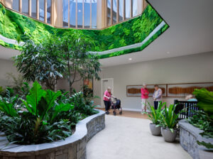
For example, when we showed an atrium and a café and bistro on the lower level, the state's initial reaction was that we were crazy from the standpoint of the life safety code. But we explained that we were providing closers that would automatically activate and isolate the atrium in the event of a fire or emergency and, once it was clear that we had a plan, it was OK. Similarly, we wanted to install a sliding barn door for the resident's bathroom. The state's code said no sliding doors, period. But Dan provided them with extensive details on the hardware, showed photos of past projects that have used this in other states for more than 15 years, and offered contact information for staff at those projects with whom the state could follow up, which they did. What finally sold them was a mock-up room we created using this door. We invited the contractor's grandmother to operate it and videotaped this, and it worked so smoothly she wanted to take it home with her. Dan later gave her a small Oscar statuette for her video performance!
Cinelli: Among other interesting features is a remote monitoring system that tracks resident behavior and alerts staff to deviations from normal behavior. It also provides documentation that can be shared with the adult children.
Ramachandran: It was another factor that helped give the state confidence in the design—it uses unobtrusive motion detectors and quiet alert systems that can be observed by staff only, without disturbing the environment. Once the state saw the technology, they were less concerned about having a traditional visual and audible alarm system.
Cinelli: We tried to make the resident rooms especially accommodating to families so that they're more comfortable and convenient for visits. This is especially important in the Texas Panhandle, where people drive 40 miles to go to dinner. If they're called into the facility for a problem only to find that mom has been put on medication and will be asleep for three hours, the room is equipped for a comfortable stay and with wireless if they want to get work done. Also, half the rooms allow residents to be easily and comfortably rolled in their beds to an outside porch.
Ramachandran: There's what we call a “deep entrance courtyard,” which is long and narrow under a roof overhang to provide shelter. This was carved out of a hillside, with a lot of cut-and-fill used to build retaining walls and add courtyards at the upper level adjoining the nursing home. Support spaces are located at the rear of the building with views of the gardens in front, using high-performance glass and overhangs to provide shade. People don't realize that about 70% of the structure is actually up against a hill, providing “earth sheltering” using the thermal mass of the soil.
Cinelli: That high-performance glass has to be strong enough to reduce sun exposure, yet not so tinted as to affect skin tone and color. We use these large windows to “reward” the residents who occupy the rooms farthest from the entrance by making their corridors single-loaded and well-lit throughout the day. Those residents have been hugely appreciative of this. D
I Advance Senior Care is the industry-leading source for practical, in-depth, business-building, and resident care information for owners, executives, administrators, and directors of nursing at assisted living communities, skilled nursing facilities, post-acute facilities, and continuing care retirement communities. The I Advance Senior Care editorial team and industry experts provide market analysis, strategic direction, policy commentary, clinical best-practices, business management, and technology breakthroughs.
I Advance Senior Care is part of the Institute for the Advancement of Senior Care and published by Plain-English Health Care.
Related Articles
Topics: Articles , Design


