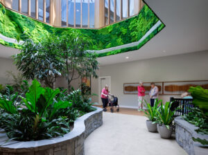
Healthy aging in the center of NYC
Ask architect Chien Chung (C.C.) Pei, AIA, what he’s most proud of in the design of the Martha Stewart Center for Living at Mount Sinai Medical Center in New York, and he’ll tell you it’s all about “flow.”
“All of the medical planning is quite exceptional in terms of flow of patients and staff,” Pei tells Long-Term Living. “It all works extremely well and gives a very high level of dignity for the patients, as well as providing all the space the staff needs. The whole look is quite different from what you find in an ordinary hospital outpatient setting.”
‘Extra level of design’
The Center provides clinical care and education for patients, offers training for physicians, and coordinates healthy-aging research. The 7,800-sq.-ft. space will allow for a 30% increase in patient caseloads over the next 15 years. The site sits in the middle of the Mount Sinai Hospital system and was originally built in the 1950s. Hospital services were housed there before the idea for an outpatient clinical geriatric medicine practice was born. Because Mount Sinai is a teaching hospital, another key component of the Center is better facilities for physician residents-in-training. These include a viewing room with one-way mirrors to observe examinations without being seen, and a greatly expanded preceptor’s room to view and discuss cases.
Pei, partner at Pei Partnership Architects, LLP, was chosen to design the Center because, according to him, “It required an extra level of design attention that most medical projects don’t require.” (Pei says that his father, architectural icon I.M Pei, 91, didn’t have input in the design, but “stayed curious about the outcome.”) Its $5 million funding (half being earmarked for building, the other half for supporting Center programs) came from another icon—American lifestyle guru Martha Stewart. While Pei says he didn’t feel pressure from his high-profile client, he was still aware of the style maven’s exacting expectations for the Center, which was dedicated to her 93-year-old mother, Martha Kostyra. Stewart wasn’t involved in the design process, but took a keen interest in materials used, says Pei. “We showed her the architectural plans and she liked them. We prepared a presentation for her to show her the different types of materials and color palettes we were considering. She was extremely helpful. We gave her some options for things we were thinking about and she picked the ones she liked or requested others. She was very decisive.” Pei says her exacting standards are why she has had such great success. “She was very easy to work with. I guess we were on the same wavelength.”
Pei also worked closely with Brent Ridge, MD, MBA, clinical assistant professor, Mount Sinai School of Medicine.
Simplicity
Pei chose design materials that aren’t usually used in a medical setting to create an environment that has a Zen-like simplicity. Stewart chose the bonsai tree as the symbol for the Center for both its longevity and beauty. Natural wood is abundant. Transparent and translucent fixed and sliding glass partitions enhance the well-lit spaces. All exam rooms are wheelchair-accessible and are spacious enough for a patient to be accompanied by a loved one. Floors are tiled instead of carpeted for more secure footing. Exam rooms have hydraulic exam tables that can be lowered to floor level for easy access; there are smaller, more intimate and tranquil waiting areas located next to exam rooms to help those who have mobility issues; colors and finishes were hand selected by Stewart, including stone flooring that minimizes dust and dirt, and special lighting that doesn’t shine directly into patients’ eyes when on exam tables is in every room.
To make the Center less clinical and more accessible for elderly patients, Pei suggested an entrance from the sidewalk along the ground-floor space. That way, patients would not have to enter the hospital to access the Center. Hospital officials, however, were worried about security issues and the need to take up more space by having another entrance. Pei persisted, however, and eventually got 100% support for the new entrance. “The Center underwrote the cost of extra security, which, as it turns out, hasn’t been necessary. I was quite proud of the fact that we were able to convince everybody that entering from the sidewalk was a good idea.”
Pei candidly says of the design, “It’s not so much we did a good job; it’s the fact that so many others don’t do a good job. That’s my major criticism. Designs [for the elderly] are not good enough. They should be a lot better.”
Pei says he talked with the staff at great length and visited the hospital before he began designing the Center. He has had an association with Mount Sinai since 1983, when he designed the new hospital building and renovated the neurosurgery suite. He also designed the Ronald Reagan UCLA Medical Center which, Pei says, embraces the idea that good architecture is an integral part of the healing process. While Pei Partnership Architects has designed these medical facilities, Pei says healthcare is not its specialty. “We are a full-service architectural firm.”
Challenges
Staying within the budget was Pei’s biggest challenge with the Martha Stewart project. Pei says the $2.5 million design and building budget was good when the project began, but commencement of building was delayed because of overly optimistic predictions of how long it would take to get regulatory approvals and relocate hospital services occupying the space that would become the Center. “Construction costs went up about 30% in New York City during that time. Our budget didn’t change, but what ended up being an ample budget to begin with became a challenge to work with. We had to do some fancy footwork to preserve the palette and not have to go back to review everything with Martha Stewart all over again.” Pei found other materials that were similar to what was originally chosen, but less expensive.
Those involved with the project were so pleased with the outcome they asked Pei to join the Brookdale Geriatrics Advisory Council at Mount Sinai so he could continue to give his input. “I said, ‘No, no! I’m just an architect. I don’t know anything about medical problems or fundraising.’” He did join, however.
Albert L. Siu, MD, chairman of the Brookdale Department of Geriatrics at Mount Sinai, says all of the physicians working at the Center are very satisfied with the space and how it works for them. “We went to great lengths planning the layout,” he says. He adds that those involved with the design had four goals: have a ground floor entrance for easy accessibility; have the Center in the same building as the hospital so patients with appointments elsewhere at Mount Sinai do not have to venture outdoors; have wide corridors and elder-friendly equipment such as exam tables that raise and lower; and have more than one waiting area to give patients more privacy. “Older patients feel threatened with a potential for disability, so we decided having more than one waiting room would be a good idea.”
“We have various specialty practices such as psychiatry, rheumatology, and geriatric medicine, so we try to be a ‘one-stop shop’ for our patients,” Dr. Siu says. The new Center makes that one stop much easier for seniors to negotiate.
For more information about Pei Partnership, visit https://www.peipartnership.com. To send your comments to the editors, e-mail hrehocik1208@iadvanceseniorcare.com.
I Advance Senior Care is the industry-leading source for practical, in-depth, business-building, and resident care information for owners, executives, administrators, and directors of nursing at assisted living communities, skilled nursing facilities, post-acute facilities, and continuing care retirement communities. The I Advance Senior Care editorial team and industry experts provide market analysis, strategic direction, policy commentary, clinical best-practices, business management, and technology breakthroughs.
I Advance Senior Care is part of the Institute for the Advancement of Senior Care and published by Plain-English Health Care.
Related Articles
Topics: Articles , Design


