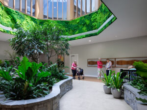
Does your facility tell a story? It might have to, if you want to survive
Daniel Pink, in his opening keynote address at the American Health Care Association/National Center for Assisted Living’s 62nd Annual Convention & Expo in Las Vegas, stated that “design” was going to be an important consideration in thriving within our new economy. When Pink referred to design, he was emphasizing more than aesthetics. He included packaging design, process design, functionality and user-friendliness. He challenged the attendees to raise their awareness of good design and bad design on a daily basis … even to the extent of journaling what we see and experience.
At this convention, good and bad design was everywhere. At the tradeshow expo hall, I encountered an interesting design element for the first time—and I have been to my share of tradeshows! The designers of the tradeshow floor broke the grid. The north/south walkways remained consistent and straight, but the east/west walkways were staggered. Just, wow. This “change” in design actually caused a person to slow down as they walked through the show floor.
I truly think that coming to a T-intersection in the walkway created more eye contact opportunities for those displaying at the tradeshow. If I were a vendor at the next show, I would look for this staggered layout and demand a spot at one of the T-intersections. From a designer’s standpoint, the broken grid did add a lot of interest to the tradeshow floor. Good or bad design? Depends on which side of the sales interaction you were on.
As I walked to the convention center from my hotel room, I realized the inspiration for the tradeshow layout. One could not walk anywhere in a straight line and without going through the casino. Pretty smart design, again, depending on which side of the “table” you were on. In both situations, the controlled circulation had a major influence on the users. I couldn’t help to consider how we influence our residents, patients, families and staff by the way we design circulation within our buildings.
Are we breaking up those long corridors? Are we giving people the opportunity to pause? And when we do, is there a story that we are telling at the pause? What do we place at those T-intersections? Hopefully not a slot machine. But hey, if the shoe fits….
Speaking of the stories we are telling in and through our buildings, how about that signage? The signage in the convention center was absolutely atrocious. It was sad to watch all of us attempt to find our first education session. None of us would have passed the mini-mental. The layout of the breakout rooms was confusing and their numbering system was actually backwards from conventional logic (pun intended). Shouldn’t Parlor A be the first room one comes to and not the last in a corridor?
As I stumbled through the first day of the convention I, of course, couldn’t help but think about how confusing some of our building layouts can be. At least with the old medical models, one just looked for the nurses’ station and could find their way out. I am not suggesting that we go back, but as we continue to move forward, we must look to “landmarking” and signage as a way to simplify our buildings and reduce the confusion that we seem to create. “Turn right at the craps table, go to the Starbucks and turn left” seemed to work here in Las Vegas!
I really believe that good design grabs your attention in a positive way. In Vegas, everyone is trying to “get your attention.” Loud sounds, loud graphics and opulent materials seem to be the norm. I noticed that the most successful attention-getters were able to quickly tell their story. With that observation comes more reflection and application. Do our interior and exterior environments tell a story? Whose story do they tell? Everyone loves a story. Let’s make sure that our good design is telling a story about who we are, what our values are and what is important to our residents.
I will leave you with the same challenge that Mr. Pink left us with. For a week, write down good and bad design in your daily living. This will raise your awareness of design. It will cause you to pause for a moment to observe and think about your surroundings. You will be convinced that for us to survive and even thrive during these challenging times, design will matter.

As Chief Development Officer, Elliott serves on the Executive Leadership Team for Vetter Health Services (www.vetterhealthservices.com). He oversees planning, design, construction, and facilities management in 33 senior living campuses in the Midwest. Elliott is currently Vice President of the SAGE Federation and serves on the AHCA Life Safety Committee. He has served as a juror for the Long-Term Living DESIGN competition.
Related Articles
Topics: Design


