Nurturing individual growth: Citation of Merit winner Good Shepherd Cottage at Santa Teresita, Duarte, Calif.
“To affirm and defend the beauty, the purpose, and the sacredness of all human life,” is part of the mission of the Carmelite Sisters of the Most Sacred Heart of Los Angeles. To the sisters, care is not a business; they call it “serving our cherished and loved elders.”
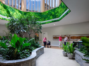
To that end, this Catholic order constructed a new assisted living residence, the $5.9 million, 20,000-square-foot Good Shepherd Cottage at Santa Teresita in Duarte, Calif. The home is part of an evolving 12-acre campus (or “Neighborhood of Care”) and the first phase of a redevelopment of much of the property. Once completed, the neighborhood will “create interrelationships between indoor and outdoor spaces, as well as other buildings, that facilitate interactions among residents, their families and staff,” according to Joyce Polhamus, vice president and director of SmithGroupJJR's Senior Living Practice, who oversaw the Good Shepherd project.
Environments for Aging 2013Citation of Merit Winners With creative solutions to design and healthcare challenges, four projects inspired Environments for Aging’s annual design competition this year. A panel of 27 esteemed jurors—architects, interior designers, care providers and educators—evaluated the nominees for this year’s top honors. We’ll be featuring a winner a day this week. We hope you’ll be inspired by these exemplary examples of environments for aging. |
The Carmelite’s approach to aging—that while physical capacities may diminish over time, the individual does not—drives the operation. This belief struck a chord with Polhamus, who wrote in the project’s narrative, that “we have capacity to continue to grow in vibrancy, interior beauty and to experience an inner fullness every moment that we are alive.” This idea inspired much of the design.
The Cottage’s concept follows the household model, with the belief that “the uniqueness of each individual…comes to its fullest fruition in the context of community,” according to Polhamus. Rooms for 26 residents (singles and doubles) on two floors are located at the perimeter of the building, providing outdoor views, as well as direct contact to the social spaces. Those central areas on each floor feature semi-separate areas—a living room, kitchen, dining room and den. Residents have the opportunity to take part in daily meal preparation in the communal kitchen. There are even counter stools so residents can visit while staff or friends cook. The 2013 Design Showcase jurors found the common areas to be a highlight of the project, lauding the “great flexibility of spaces,” and noting that “The scale of the common living areas—and really all of the spaces—is great.”
Welcoming and familiar touches were designed to make the Cottage look like home. They include a two-sided central hearth, full-height windows and built-in bookshelves. A dining room connects to the kitchen and shares the central hearth of the living room. The hub—the living room—features a view of the surrounding landscape and natural light. Polhamus says this is her favorite feature of the Cottage. “You get the light from many different perspectives at different times of the day, as you would in any private home,” she says.
Socializing also happens outside on a first floor patio, and upstairs on an outdoor deck with mountain views. On the patio, raised gardens, a gas grill and picnic tables encourage activity and engagement. Of the walking paths that lead to existing and future campus destinations, one juror remarked: “The exterior gardens and walking path are superb. I want to live here!” Polhamus’s design includes thoughtful private spaces as well. Rooms are equipped with kitchenettes and sitting rooms for private entertaining.
Polhamus says it was the sisters who suggested the Craftsman design that blends in with their Los Angeles neighborhood and reinforces the residential feel of the Cottage. The theme is carried indoors, as well with relatable, understandable interiors. A residential-style foyer, for example, leads to the rest of the house and allows residents and guests someplace to put their coats. Simple lines and a mix of stone, wood flooring, exposed wood structure and warm colors, and residential cabinetry and furniture contribute to the “home” feel. “Honestly,” says Polhamus, “the kitchen cabinets are something I would want in my own house.”
Polhamus credits her client with much of the project’s success. “The sisters were very thoughtful and committed, and always ready to go,” she said. “That’s why all the details worked together, because of their time and energy.”
Gina LaVecchia Ragone is a freelance writer based in Cleveland.
To learn more about design in senior housing and long-term care, follow Long-Term Living’s coverage of the Environments for Aging Conference, to be held April 6-9 in New Orleans.
I Advance Senior Care is the industry-leading source for practical, in-depth, business-building, and resident care information for owners, executives, administrators, and directors of nursing at assisted living communities, skilled nursing facilities, post-acute facilities, and continuing care retirement communities. The I Advance Senior Care editorial team and industry experts provide market analysis, strategic direction, policy commentary, clinical best-practices, business management, and technology breakthroughs.
I Advance Senior Care is part of the Institute for the Advancement of Senior Care and published by Plain-English Health Care.
Related Articles
Topics: Articles , Design


