Obstacles and Solutions in real-world design
For the fifth year in a row, participants in the DESIGN Showcase were asked to discuss the real challenges they faced in developing and executing a design. Going beyond displaying a project's highlights, many honestly laid out the difficulties they encountered in realizing success. Here are excerpts from this year's entries:
Edgewater: AG Architecture, Inc.
Obstacle: When creating a residential-inspired skilled nursing facility, the sponsor's intentions sometimes conflict with local codes and standards. As such, the team must work diligently to communicate with and educate local officials in order to make the desired advancements a reality. In some cases, the best efforts still cannot penetrate code restrictions and compromises must be made that do not favor the desires of the design team. Such obstacles occurred within the skilled nursing component of this project.
The owners wanted to incorporate cooking capabilities within each household, but despite discussions in favor of this cutting-edge design philosophy, state restrictions prohibited the design of fully functioning kitchens accessible to residents.
Solution: The initial reaction was to create “activity kitchens” alongside dining areas which were placed in immediate adjacency to a commercial-grade serving kitchen shared by two households. In practice however, the staff has, in fact, used these activity kitchens in the true spirit in which they were designed and a portion of the actual daily food preparation is done in these areas. The end result is an environment that functions in a similar manner to a residential kitchen with an adjacent dining scenario as found in single-family environments.
Miller Rehabilitation at Sojourn: AG Architecture, Inc.
Obstacle: Innovative design solutions impact construction costs and require a thoughtful design team who can adapt to obstacles in order to find different ways to achieve the desired results. In the case of this project, numerous redesign phases were required to maintain the integrity of the innovative solutions through the use of different materials and other means of cost reduction.
Solution:
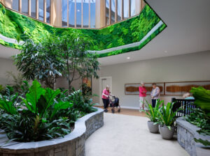
Providing access to natural light helps heal the spirit and was an important aspect of the design. Due to budget restrictions, however, this design element had to be readdressed. Although the number of skylights was reduced, the design was creatively re-engineered to achieve the desired light levels.
Interior selections were value engineered in order to meet budgetary requirements without losing the original design intent. For example, specifying paint in place of wall covering in selected areas actually improved the feel of the space while also supporting the budget.
This expansion had an aggressive agenda (in terms of implementing a variety of design objectives) with equally challenging budget limitations. Personalized attention was achieved by utilizing a development consultant to manage the construction process. In addition, the architect, with considerable long-term care experience, employed a unique methodology of creating highly detailed estimates earlier than usual in the process. Complicated subsoil and existing utility systems provided further challenges, but team members worked together in the spirit of cooperation to achieve the provider's lofty goals.
Danberry at Inverness: CJMW
Obstacle: A road separated the lower half of the site, where zoning would permit only cottages, from the upper half, where the main building would have to be located. Initially, the project team thought that separating the cottages would be a problem, but the project team came to view it as an advantage.
Solution: A small lakefront clubhouse was added to serve as a community center for the cottage neighborhood, and the cottages were designed to appeal to younger, more active seniors who, although they like the security and services provided by being part of a CCRC, don't feel ready to live in “an old folks home.”
Penick Village: CJMW
Obstacle: In the past, North Carolina's Department of Health Services Regulation had not permitted licensure of small homes like the Garden Cottage unless they contain all the institutional requirements of larger facilities.
Solution: At Penick Village's invitation, the chief of the Division of Health Service Regulation took a personal interest in shepherding the Garden Cottage through the regulatory process, mapping the way for North Carolina's first licensed assisted living cottage and also the way for the next cottage, which will be licensed skilled nursing.
Norwood Crossing: Hanna Z Interiors, Ltd.
Obstacle: The budget was very small. A contract for the interiors scope of work was drawn up near the end of construction and specified a fixed, non-negotiable sum. It was so low that the design firm had to scavenge and reuse furnishings from the organization's existing facility. Even with that, there was less existing furniture than originally promised.
Solution: Although base paint colors applied during construction became the primary palette for the décor, a few accent colors and wallpapers were added in public areas. The designers worked closely with the project architect to add interior interest. Rather than typical drop ceiling/fluorescent light boxes, ceilings were raised and the designers strategically added crown molding, larger pendant lighting, ceiling tiles, and structural beams to highlight the architecture and create the illusion of coffered ceilings. Different flooring materials were used to break up monotonous space and create interest. Handrails were specified with thicker, more detailed wood for a more residential effect. It was necessary to be resourceful on art and furnishings-scouting attics to find extra items and only replacing fabrics and touching up scratches on existing furniture.
The Mary Taylor House: Wallace Roberts & Todd, LLC
Obstacle: During design, the team encountered new, more stringent ordinances which required high levels of storm water volume and quality to be managed onsite.
Solution: The design team determined that providing a vegetated roof on the building could meet the local water control requirements and eliminate the need for a costly underground storm water tank. The team met frequently with local officials to communicate the storm water management capabilities of green roofs. The team also provided documentation early in the process that proved an extensive green roof could handle the required rainwater infiltration and storage rates. This proactive approach not only helped save the cost of underground storage, but it also accelerated the local approval process. The green roof also fit into the sustainable goals for the project, which was targeting both LEED Gold and an Energy Star rating.
Hospice House Brookside: Collman & Karsky Architects
Obstacle: The client wanted as many resident rooms as possible on the ground floor for ease of evacuation of the residents in the event of a disaster.
Solution: The shape of the site and locations of the mature trees dictated the building footprint and thus the organizational layout of the residential wings in the building and where the support services could be located. The design team located the commercial kitchen on the second floor over one of the residential wings.
Timber Ridge at Talus: Rice Fergus Miller
Obstacle: Zoning allowed for a high-rise building and the size of the site dictated that this was a necessity to fit the owner's programmatic requirements. The building is the first high-rise construction type in the city and therefore from a building code and inspection standpoint, there was significant education by the team to accomplish the permitting process and obtain final certificate of occupancy.
Solution: In the end, the city declared the project a great success because of the added community amenities, LEED rating, and local job creation as well as the architectural character of the building supporting the goals of Talus. The success is symbiotic as the surrounding master plan contributes to a high quality of life for the residents and staff by offering walking trails featuring natural landscaping, mountain views, and future dining and shopping opportunities.
Tohono O'odham Assisted Living Elder Homes: Lizard Rock Designs, LLC
Obstacle: Traditional assisted living facilities do not address specific cultural aspects of Native American communities.
Solution: Many focus groups were held with residents, family members, and the staff to shape the design of the homes. Three key priorities emerged: maximize outdoor views, access, and living space; provide layers of privacy between individual suites and common areas; and honor traditional customs. The plan reflects these priorities by providing multiple ways to live and be connected to nature and locating the den as a secondary layer between private and public spaces. Traditional customs are acknowledged by providing both indoor and outdoor fireplaces to honor resident requests that they have a place to cook outdoors with traditional mesquite wood. At least one of the homes will feature a sauna to accommodate native healing rituals.
Casitas on East Broadway: Lizard Rock Designs, LLC
Obstacle: Sustainable design techniques are not feasible in low-income housing projects.
Solution: The design team made every effort to maximize sustainable design without adding cost-for example, the project received substantial LEED points for its density, use of an existing infill site, and compliance with the city of Tucson low-water use and native plant ordinances. The design team also evaluated available LEED points, provided approximate cost estimates for these points, and agreed on which items could be accommodated within a HUD budget. Highly efficient mechanical units, low water use plumbing fixtures, high-value insulation, windows, and a shade trellis component made from recycled materials, and recycled and low-VOC interior finishes were incorporated without exceeding the project budget.
Good Shepherd Home: Withers Design Group, Inc. Architects
Obstacle: The existing resident rooms were mostly the semiprivate type typical of a past era, with no bathing facilities in the rooms, and four residents sharing a toilet room. The corridors were long and straight, with no open spaces and little visual interest.
Solution: A new resident wing was designed with 23 private rooms and eight semiprivate rooms, all with European-style tiled bathrooms with showers. The rooms are large enough to allow for residents to have some personal furnishings. New corridors are 20-ft. wide to allow for easy navigation and to create areas for residents to interact with staff and visitors.
Pines Village Retirement Communities: Community Living Solutions, LLC
Obstacle: The facility was to remain occupied (150 residents) and fully operational during the entire 18-month construction process.
Solution: To minimize the disruption, the first phase involved adding 10 new apartments onto the ends of two wings. After residents were relocated to their new homes, phase two entailed demolishing the vacated apartments to make room for the new, centralized community spaces. Additionally, the entire facility received a new roof and new wall and floor coverings. Residents were encouraged to participate in the project from the early visioning stages and received their own personal copy of the floor plans that they brought to weekly meetings on Wednesday mornings. Attendance at these meetings quickly grew from 20 to an average of 65 participants. One resident was particularly impressed with this “very helpful little tool.” This gathering was crucial to communicate progress, address their questions/concerns, incorporate their ideas, and achieve one of the ultimate project goals which was to rebuild the heart of interest of the residents. As one resident, who moved in mid-construction noted, “We were amazed that the construction was able to progress with well over 100 residents living here. For us, it created very few problems and was handled very well. Maybe because we came in the middle of it, it seemed natural!”
Design Environments for Aging 2010 2010 March;():27-31
I Advance Senior Care is the industry-leading source for practical, in-depth, business-building, and resident care information for owners, executives, administrators, and directors of nursing at assisted living communities, skilled nursing facilities, post-acute facilities, and continuing care retirement communities. The I Advance Senior Care editorial team and industry experts provide market analysis, strategic direction, policy commentary, clinical best-practices, business management, and technology breakthroughs.
I Advance Senior Care is part of the Institute for the Advancement of Senior Care and published by Plain-English Health Care.
Related Articles
Topics: Articles , Design


